 MegaMegaTypeType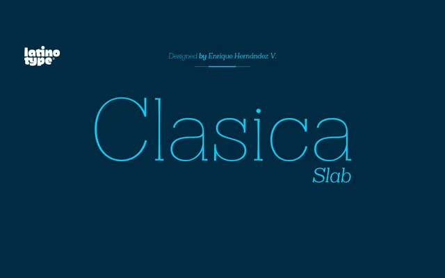
A nine-weight slab serif by Enrique Hernández, drawing on Optima's thin vertical strokes and applying symmetrical serifs to create a distinct editorial character.
About
Released in 2014, Clasica Slab takes its proportional cues from Optima while adding symmetrical serifs that shift the design into slab territory. The family spans nine weights from Thin to UltraBlack, each with a matching italic, totalling 18 styles. Alternate glyphs for a, e, f, g, r and y offer typographic flexibility across titles, body text and editorial layouts.
Classification
A slab serif with notably thin vertical strokes and symmetrical serifs, inspired by Optima's proportions. The humanist optical qualities and vertical stress place it firmly in the humanist slab category.
Weights
ThinLightBookRegularMediumBoldHeavyBlackUltraBlack
Languages
Latin
Tags
slabhumanisteditorialmagazineoptima-inspiredtextbookversatile