 MegaMegaTypeType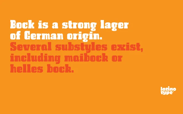
A compact, experimentally-minded slab serif built around asymmetric strokes, designed for short-form applications such as logotypes and editorial headlines.
About
Bock takes the slab serif as a starting point but deliberately disrupts typographic rhythm through asymmetric lines, making it suited to logotypes and editorial captions rather than running text. The Fat variant pushes the concept to an extreme, eliminating the negative space within and around letterforms to produce a dense, high-impact weight. Two styles in total, both at display weight.
Classification
Categorised as slab serif due to its foundation in the slab serif style, though it departs from convention through asymmetric lines and an intentionally rhythm-breaking compactness that pushes it toward display territory.