 MegaMegaTypeType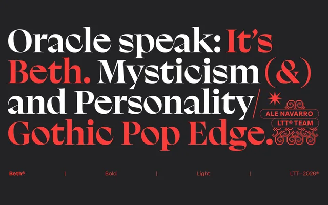
A high-contrast display serif rooted in early-twentieth-century English shopfront lettering and the engraving tradition of Gustave Doré and William Blake, offered in seven weights across standard and alternate character sets.
About
Beth draws on Neoclassical uppercase forms with humanist terminals and convex strokes borrowed from hand-painted signage, paired with a lowercase modelled on Edward Johnston's Foundational Hand. The contrast between thin and thick strokes recalls copper-plate engraving, creating a typeface that shifts character dramatically across its weight range, from delicate Light to forceful Black. Each weight ships in two versions — a standard and an alternate character set — giving 14 styles in total, alongside 594 glyphs and discretionary ligatures.
Classification
A high-contrast display serif drawing on Neoclassical letterforms, calligraphic models (Johnston's Foundational Hand) and engraving traditions. The pronounced thick-thin contrast, humanist terminals and convex strokes place it firmly in the display serif category with gothic influences.