 MegaMegaTypeType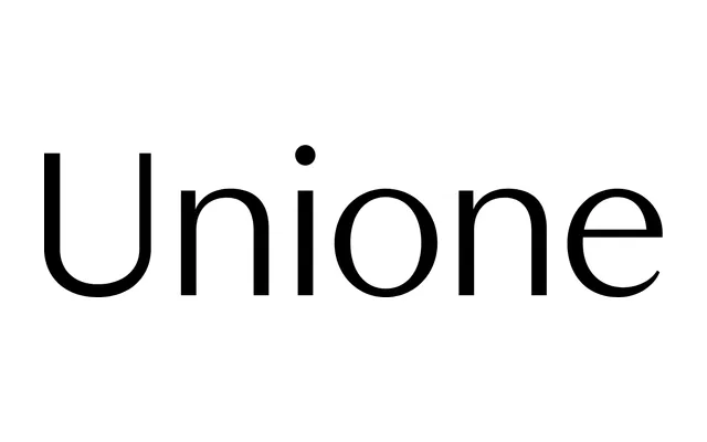
A flared sans-serif in the Optima tradition, reinterpreted with cooler, more structural precision across six weights and matching italics.
About
Where Optima carries warmth and calligraphic suggestion, KP Unione strips that back to a tighter grid: straight-edged terminals and controlled stroke contrast that feels architectural rather than hand-drawn. The family spans Light to Black in both upright and italic, with OpenType features including single-storey alternates, circled numerals, old-style figures and case-sensitive punctuation. It occupies a genre that has always divided opinion, and makes no attempt to resolve that tension.
Classification
A flared sans with visible stroke contrast, placing it in the Optima tradition of seriffless typefaces that hint at calligraphic structure without committing to serifs. The foundry classifies it as humanist geometric, and the design sits between those poles: geometric in grid and structure, humanist in its modulated strokes.