 MegaMegaTypeType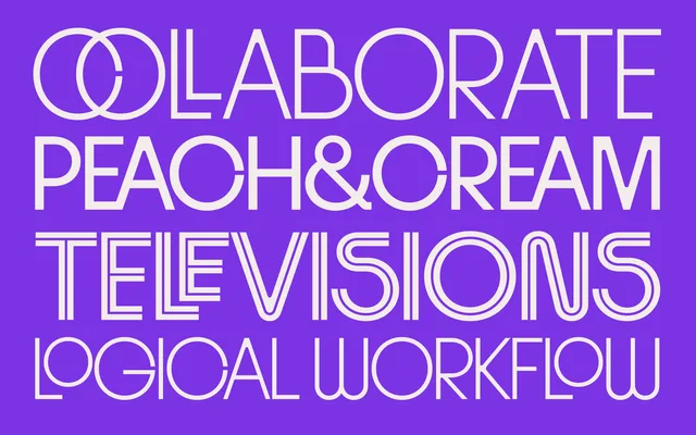
The headline-scale companion to Riant, with high-waisted s forms and folded finials for a livelier display presence.
About
Riant Display takes the same early twentieth-century geometric starting point as its text companion and pushes it toward the unexpected, with dynamic curves, rhythmic contrasts, and randomised OpenType alternates for stemmed or rounded lowercase. It is built for striking headlines and branding rather than body copy.
Classification
The display companion to Riant, built from the same geometric sans roots but pushed toward playful, headline-scale character with high-waisted forms and folded finials.
Weights
LightRegularMediumSemiboldBoldInline
Family
Languages
Latin
Tags
geometric sansdisplayheadlineseditorialbranding