 MegaMegaTypeType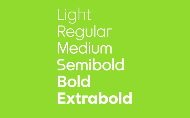
A geometric sans that keeps the clarity of early twentieth-century construction while adding the optical tweaks a text face needs.
About
Riant takes the geometric sans tradition and pulls it back from pure mathematics toward comfortable reading, with rounded alternate lowercase forms and traditional text-type junctions on offer through OpenType. Six weights with italics cover body text through to headline use, alongside its display companion Riant Display.
Classification
Draws on early twentieth-century geometric sans construction but adds optical adjustments for sustained reading, so it reads as a text-friendly geometric rather than a strict mathematical one.
Weights
LightLight ItalicRegularItalicMediumMedium ItalicSemiboldSemibold ItalicBoldBold ItalicExtraboldExtrabold Italic
Family
Languages
Latin
Tags
geometric sanstexteditorialvariablerounded alternates