 MegaMegaTypeType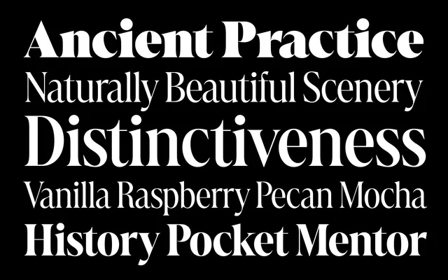
A condensed, high-contrast display serif that borrows the flamboyance of Belle Époque and Art Nouveau lettering.
About
Marlide Display roots its elegant, roundly bracketed serifs and considerable thick-to-thin contrast in Roman inscriptions and neo-Renaissance forms, then filters them through the ornamental spirit of the Belle Époque. Condensed proportions make it a natural fit for logotypes and large-scale headlines.
Classification
A condensed, high-contrast serif drawing on late nineteenth-century Latin forms and Art Nouveau ornament, built for large-scale display rather than text.
Weights
LightRegularMediumBoldExtraboldHeavy
Optical sizes and widths
condensed
Languages
Latin
Tags
high contrastdisplay serifcondensedart nouveaulogotypes