 MegaMegaTypeType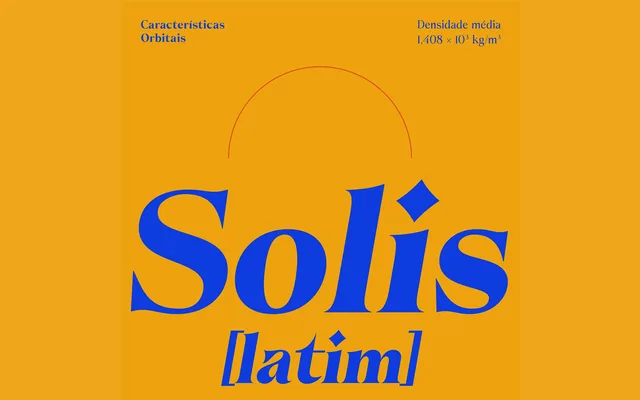
A high-contrast display serif in seven weights with italics, drawn by Brígida Guerreiro and inspired by editorial typography of the 1970s and 80s.
About
Taiyo Serif's strong stroke contrast gives it a decisive character in headlines and titles, while remaining legible enough for body text in both print and digital contexts. The family spans seven weights from Light to Black, each with a matching italic, and covers more than 60 Latin-derived languages via a character set that includes diacritics, ligatures and symbols. The thematic concept draws on solar imagery, with the design conceived as an ode to the sun's solar flares.
Classification
A high-contrast serif with strong stroke modulation inspired by editorial typography of the 1970s and 80s. The pronounced contrast makes it well-suited to display and headline use, placing it within the tradition of editorial serifs.