 MegaMegaTypeType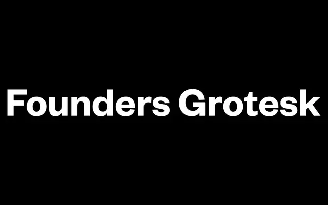
A contemporary grotesque synthesising early 20th-century British foundry specimens – Millar & Richard and H.W. Caslon's Doric – into a large, versatile collection spanning core, Text, Condensed, X-Condensed and Mono variants.
About
Designed by Kris Sowersby and released in 2010, Founders Grotesk draws from Millar & Richard's 1912 Grotesque series and H.W. Caslon's Doric, coupling their serpentine curves and narrow apertures with the close spacing of Helvetica Halbfett headline cuts. The collection spans five sub-families covering tight display work down to small-body legibility, with the Text variant developed separately after the headline original proved too tight at reading sizes. Condensed and X-Condensed cuts draw on Miller & Richard's Sans-Serif No.5 for square inner counters contrasted against warm outer curves.
Classification
Modern grotesque drawing on Millar & Richard's 1912 Grotesque series and H.W. Caslon's Doric series (1919), with spacing influenced by Helvetica Halbfett headline cuts from the late 1950s. Serpentine S, narrow apertures on C and G, and selective historical letterform choices give it warmth uncommon in contemporary grotesques.