 MegaMegaTypeType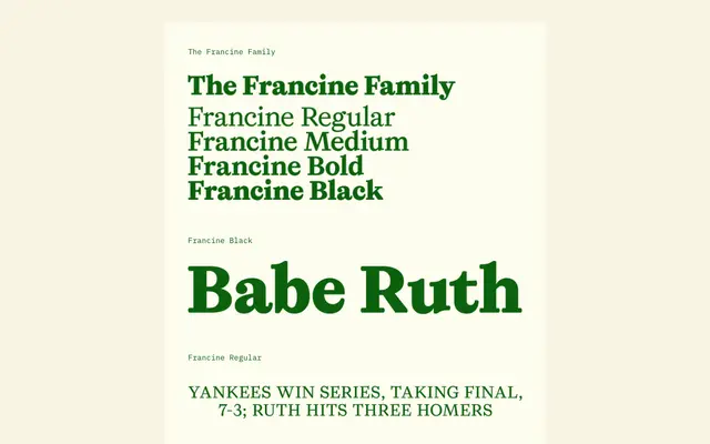
A text serif that blends old-style structure with Bauhaus-inflected rounded geometry, landing somewhere between professional and unapologetically graphic.
About
Francine merges old-style serif foundations with Bauhaus geometry: overweight curves, bulbous ball terminals, and rounded letterforms that verge on cartoon-like. Three text weights (Regular, Medium, Bold) give it a working hierarchal range, while the Black weight shifts into display territory. The resulting family sits at the intersection of commercial, pop-culture, and editorial — readable without being restrained. Designed by Emily Klaebe during the Type West 2022 programme at Letterform Archive.
Classification
Old-style serif foundations with Bauhaus-influenced geometry applied through overweight curves, bulbous ball terminals, and rounded letterforms that push toward the cartoon-esque. Regular, Medium, and Bold function as text weights with hierarchal range; Black is the display weight. Designed during the Type West 2022 programme at Letterform Archive.