 MegaMegaTypeType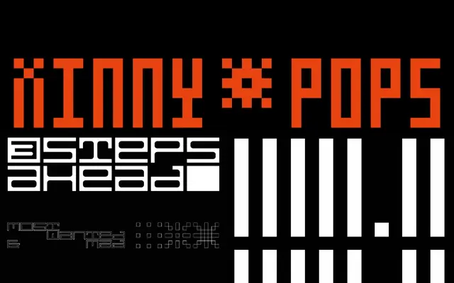
A display grotesque inspired by the Dutch club and music scene of the late 1970s to 1990s, notable for its embedded diacritics and five-width range across three subfamilies.
About
Pakatel draws on the visual culture of Dutch club typography, where atmosphere and identity took precedence over readability. Its most distinctive technical feature is the integration of diacritical marks within the letterforms themselves, allowing the type to be set both horizontally and vertically without disrupting overall layout rhythm. The family spans five widths from Ultra Condensed to Ultra Expanded, with three subfamilies: Pakatel, Pakatel IN and Pakatel OUT.
Classification
A display-oriented grotesque with multiple width variants and embedded diacritics, designed for both horizontal and vertical typesetting. Its club-culture origins and deliberate legibility trade-offs place it firmly in the display category rather than functional text use.