 MegaMegaTypeType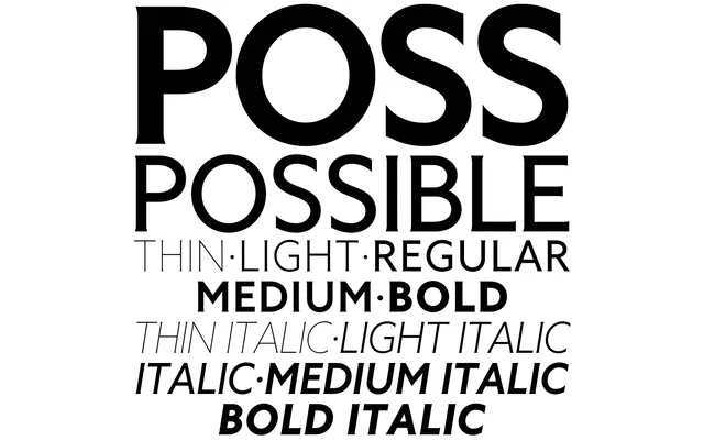
A dual-classification typeface in five weights that blurs the boundary between sans-serif and glyphic serif, drawing on Percy J Delf Smith's 1928 Petit Serif and Johnston's Underground.
About
Possible is released simultaneously as Possible Sans and Possible Serif – two identical families distinguished only by their classification, making the naming as much a conceptual statement as a functional one. The design takes its primary cue from Percy J Delf Smith's caps-only Petit Serif (1928) and Edward Johnston's Underground lettering, augmented by geometric and humanist influences that improve legibility at smaller sizes. Unlike its historical references, Possible includes a full lowercase and Latin Extended-A character set across all five weights, each paired with an optically corrected italic.
Classification
Possible occupies an ambiguous category by design: it presents as a glyphic or spur-serif face that functions equally as a sans-serif, with micro-serifs so subtle the face reads as either. This dual identity makes 'glyphic' the most precise subcategory, sitting between humanist sans and serif traditions.