 MegaMegaTypeType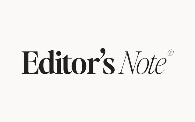
A 16-font editorial serif in eight weights, each paired with an italic, designed for large-scale display settings such as headers, pull quotes and calls to action.
About
The family's crisp construction and deliberate letter spacing make it most effective at headline sizes, where its refined contrast reads cleanly. Eight weights from Hairline to Bold offer considerable range across branding and editorial work. The designer notes the spacing is intentionally balanced for clean reading, recommending tighter tracking for all-caps treatments.
Classification
A crisp, elegant serif designed primarily for display use at large sizes, with high contrast and refined letterforms suited to headers, quotes and calls to action. Its intentional letter spacing and clean construction place it within the editorial serif tradition.