 MegaMegaTypeType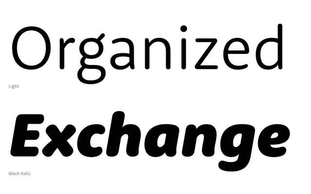
A humanist sans-serif with softly rounded terminals built from classical proportions, designed as the companion to the serifed Rooney Pro.
About
RooneySans balances open, wide letterforms with loose spacing to achieve strong legibility at text sizes. The rounded terminals are not retrofitted onto squared stems but were incorporated from the outset, giving the typeface a natural warmth rather than a mechanical finish. Twelve styles span six weights with matching italics, covering 481 glyphs per style.
Classification
A humanist sans-serif with softly rounded terminals applied to classical proportions, bridging geometric warmth with legible open letterforms. The rounded details are integral to the design rather than applied as a modification.
Weights
LightRegularMediumBoldHeavyBlack
Languages
Latin
Tags
roundedhumanistlegiblewarmplayfulsans-seriftextcompanion