 MegaMegaTypeType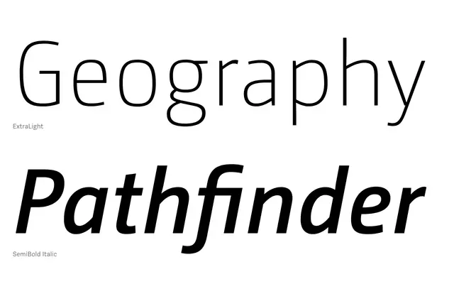
A humanist sans-serif with Dutch roots, balancing technical precision with warmth through squarish round forms, open shapes and generous ascenders and descenders across seven weights with italics.
About
CamingoDos Pro sits between technical clarity and humanistic readability, with round letterforms that lean toward squareness and open counters that aid legibility at text sizes. The Dutch formal heritage softens what might otherwise be a purely functional appearance, producing a calm and even texture on the page. At larger sizes the design gains conciseness and presence, making it well suited to editorial and corporate applications.
Classification
A humanist sans-serif with Dutch formal origins, featuring round letterforms that tend toward squareness, open shapes, and long ascenders and descenders. The balance between technical precision and humanistic warmth places it firmly in the humanist sans tradition.