 MegaMegaTypeType
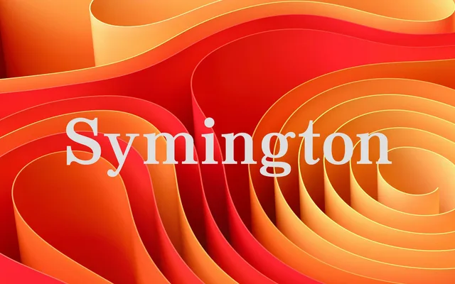
A sturdy 20th-century-style text serif in two weights with italics, for headlines and long reading alike.
About
JT Symington has well-defined bracketed serifs and an even texture in running text. Its bold holds up in headlines without crowding, and the italic is warm and readable. Four styles keep it a compact editorial workhorse.
Classification
Bracketed serifs, moderate contrast and a vertical stress follow the 20th-century newspaper and book serifs it draws on, placing it in the transitional group.
Weights
RegularBold
Languages
Latin
Tags
seriftransitionaleditorialtextbookheadlineclassic