 MegaMegaTypeType
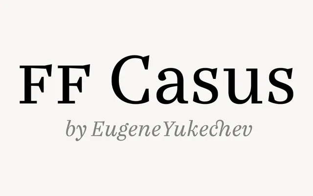
Eugene Yukechev's warm text serif, based on early 18th-century book types and released by FontFont in 2017.
About
FF Casus draws on the sturdy serifs of early 18th-century printing, with slightly narrow proportions and a large x-height that save space without hurting legibility. Moderate contrast and a faint handmade quality keep long text warm on paper and screen. Six weights with italics cover books, magazines and reading-heavy websites.
Classification
Text serif modelled on the sturdy book types of the early 18th century, with slightly narrowed proportions, moderate contrast and a generous x-height. Six weights with italics, drawn by Eugene Yukechev.
Weights
LightRegularBookDemi BoldBoldBlack
Languages
Latin
Tags
seriftextbookeditorialwarmtransitional