 MegaMegaTypeType
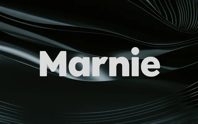
A clean geometric sans in six weights with italics, aimed at headlines and short text in advertising and packaging.
About
JT Marnie follows the 1920s and 30s geometric sans with round bowls and even strokes. The thin weights are crisp and airy, and the bold and extra bold give headlines a compact punch. It is happiest in advertising, packaging and short blocks of copy.
Classification
Circular bowls, a single-storey a in the lighter cuts and even strokes follow the interwar geometric sans model. The heavier weights are tighter and more compact.
Weights
ThinLightRegularMediumBoldExtraBold
Languages
LatinLatin Extended
Tags
geometricsans-serifheadlineadvertisingpackagingbrandingcontemporary