 MegaMegaTypeType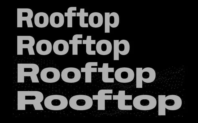
A squarish humanist grotesque rooted in early American Gothic tradition, built out across six widths with eight weights, italics, a Mono companion and a three-axis variable font.
About
Rooftop takes the sturdy construction of Lining Gothic and related early 20th-century American grotesques as its starting point, pairing that geometry with humanist proportions and distinctively squared ovals. The family is unusually complete: six widths from Ultra Condensed to Extended, eight weights per width each with matching italics, a dedicated Mono subfamily, and a three-axis variable font spanning weight, slant and width in a single file. Extended Latin and Cyrillic are supported throughout.
Classification
American grotesque revival filtered through humanist proportions, with distinctively squarish ovals and sturdy stroke construction drawing on Lining Gothic and Gothic No. 2 as historical references. Six widths, three-axis variable font, and a Mono subfamily make it an unusually complete system for the genre.