 MegaMegaTypeType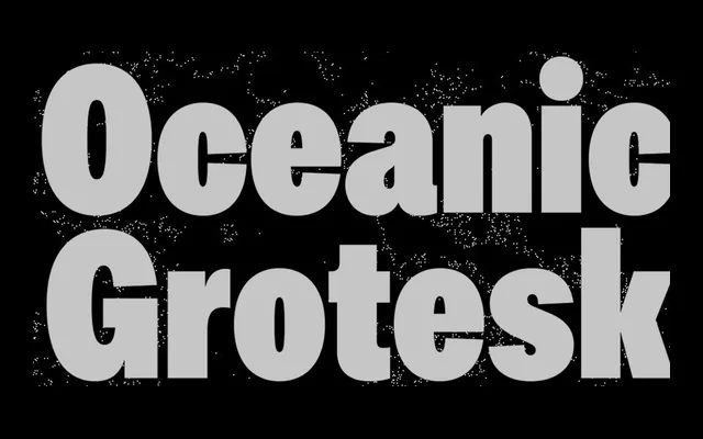
A condensed neutral grotesque from Paris-based Interval Type, designed as a companion to the Oceanic serif family with matching vertical metrics across six weights and a variable font.
About
Oceanic Grotesk Condensed takes its cues from mid-century modernist type: neutral, upright and space-efficient. Six weights from Light to Poster, each with a matching italic, give it range across body text and display work. Shared vertical metrics with Oceanic Text make it a natural fit within the wider Oceanic collection, and variable font support adds deployment flexibility.
Classification
Neutral, upright condensed grotesque drawing on mid-20th century modernist principles. Designed as a companion to the Oceanic serif superfamily, sharing identical vertical metrics with Oceanic Text. Variable font available alongside static instances.