 MegaMegaTypeType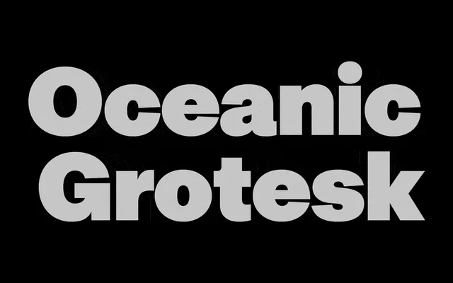
A clean, neutral neo-grotesque built primarily as the sans-serif half of Interval Type's Oceanic system, sharing vertical metrics with its serif counterparts across six weights and full italic coverage.
About
Oceanic Grotesk takes its cues from mid-20th century European modernism, sitting closer to Swiss neutrality than to expressive display work. Its most practical asset is metric compatibility with Oceanic and Oceanic Text, meaning serif and sans can swap without reflow. Six weights plus italics, Condensed and Compact subfamilies sold separately, and an included variable font round out a well-organised system with Extended Latin and Cyrillic coverage across 41 languages.
Classification
Neutral modernist grotesk in the mid-20th century European tradition. Designed explicitly as a metrically matched companion to the Oceanic serif family, sharing identical vertical metrics with Oceanic Text. Prioritises neutrality and simplicity over personality. Alternate characters for a, K and R offer modest variation. Distributed as static fonts and a variable font.