 MegaMegaTypeType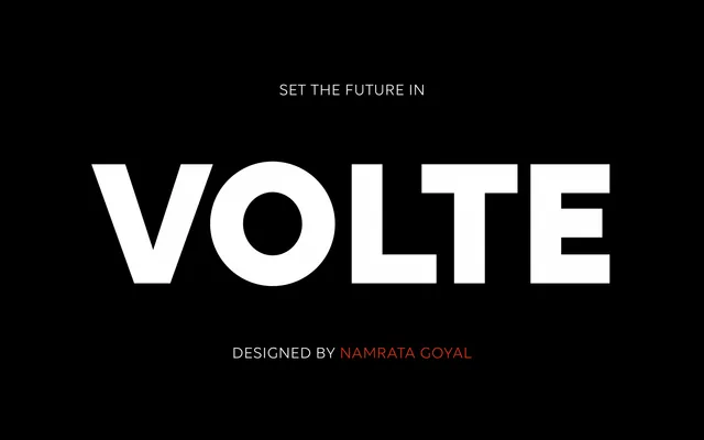
A five-weight geometric sans from ITF with open, airy letterforms that prioritise legibility over the closed, constructed look typical of the genre.
About
Designed by Alisa Nowak, Jérémie Hornus and Namrata Goyal and released in 2015, Volte takes a mono-linear approach to geometric sans with letterforms deliberately kept open to improve legibility at both text and display sizes. The five-weight range from Light to Bold, each with a corresponding italic, gives it practical range for branding, editorial and screen work. Its simplified construction sits closer to humanist geometry than the rigid circles of a strict Futura-derived model.
Classification
A geometric sans-serif with mono-linear strokes and open, airy letterforms. The foundry classifies it as both Sans and Display, reflecting its versatility across body text and headline use. Also sold in Devanagari versions.