 MegaMegaTypeType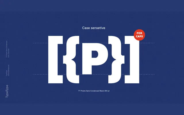
A neutral open grotesque from TypeType released in 2014, offering five weights with italics in both standard and condensed widths, covering Latin and Cyrillic scripts across 160+ languages.
About
TT Prosto Sans takes its name from the Russian word for 'simply', which accurately reflects the design's ambition: clean, emotionally inert forms intended to carry meaning without graphic interference. The family follows a conventional weight structure from Thin to Black with accompanying italics, totalling 20 styles across two widths. Broad Latin and Cyrillic coverage makes it a practical choice for multilingual projects requiring a dependable, unshowy text face.
Classification
An open grotesque with modern proportions and classic weight progression. The design is deliberately neutral, prioritising legibility and utility over typographic expression.