 MegaMegaTypeType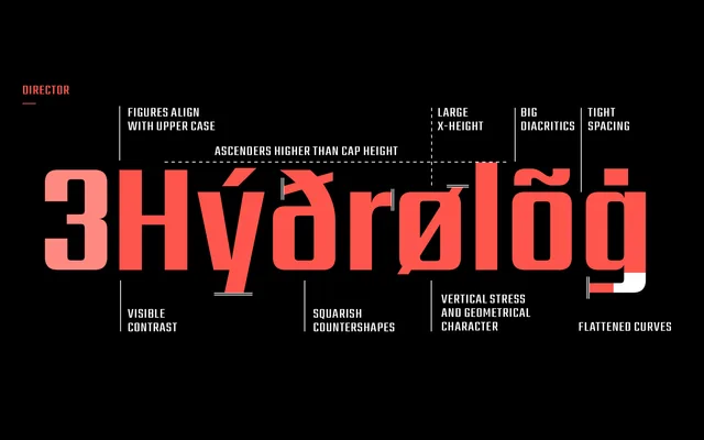
A five-weight Latin display family in which horizontal strokes stay constant while vertical strokes thicken progressively, producing a shift from near-monolinear to severe contrast without sacrificing its squared, minimal character.
About
Director keeps all horizontal strokes at a uniform thickness across its five weights, so only the vertical strokes change – from almost monolinear in Regular to strongly contrasted in Heavy. This modular logic gives the family a consistent squared silhouette regardless of weight, making it adaptable across branding, posters and broadcast contexts. Designed by Manushi Parikh and released by ITF in 2015, it covers a wide range of Latin-script languages.
Classification
A minimal Latin display family with monolinear to high-contrast stroke variation across weights, retaining a squared, modular appearance throughout. The deliberate horizontal-stroke consistency and squared geometry place it firmly in geometric sans display territory. Also sold in Bengali, Devanagari, Malayalam, Tamil versions.