 MegaMegaTypeType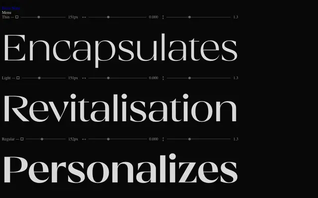
A five-weight display family by Andreas Eijerfors and Maria Fredman that sits between serif and sans, using dramatic stroke contrast and selectively placed inward-flaring serifs to create an individual rhythm suited to headlines and branding.
About
Drawn with sculptural curves and high contrast, IKN Karisma takes Didone elegance as its starting point but applies it selectively rather than systematically, producing a typeface that doesn't resolve cleanly into either serif or sans. Five weights from Thin to Black are supported by ten stylistic sets, an extended ligature set, arrows and full OpenType feature support. With 609 glyphs across 150 languages, the family is well equipped for multilingual editorial and packaging work.
Classification
A high-contrast display typeface that occupies a hybrid position between serif and sans, drawing on Didone tradition with dramatic stroke contrast and occasional inward-flaring serifs while forgoing a conventional serif structure throughout.