 MegaMegaTypeType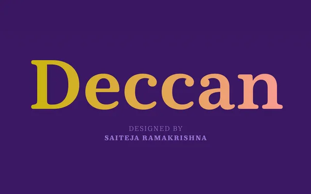
A high-contrast slab serif with ball terminals and soft curves, drawing on 19th-century British modern type traditions to produce a face well-suited to editorial and text settings.
About
Designed by Ramakrishna Saiteja and released in 2015, Deccan pairs the visual energy of Victorian-era modern types with a warmth that keeps it approachable at text sizes. Its ball terminals appear consistently across both numerals and lowercase letters, giving the family a distinctive character that rewards close reading. Five weights with true italics make it versatile across publishing, branding and packaging contexts.
Classification
A slab serif with soft, ball terminals and high contrast that evokes 19th-century British modern types. The humanist warmth in its letterforms distinguishes it from more geometric or mechanical slab traditions. Also sold in Telugu versions.