 MegaMegaTypeType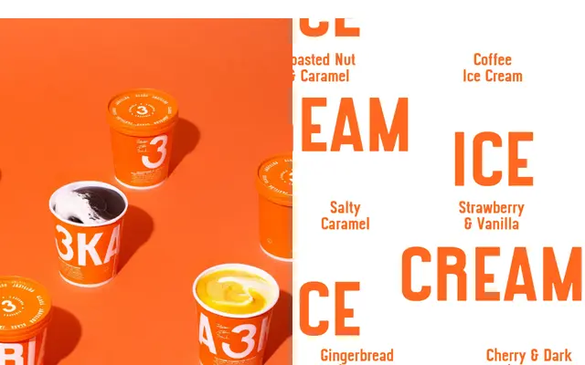
A bespoke display typeface created for Finnish ice cream brand 3 Kaveria, drawn from Italian signpost lettering and designed to cut through the visual noise of supermarket freezers.
About
Commissioned as part of a full rebrand by Helsinki creative agency Kuudes, the typeface forms the dominant element of the 3 Kaveria visual identity. Its letterforms were inspired by an Italian signpost, lending the design a bold, irregular character that sits somewhere between vernacular lettering and deliberate brutalism. The brief demanded something legible and arresting at freezer-aisle distances, where shelf standout is everything.
Classification
A bespoke display typeface designed to dominate retail packaging and freezer shelves, with letterforms inspired by Italian signage – pointing to a bold, expressive display character rather than any conventional text category.