 MegaMegaTypeType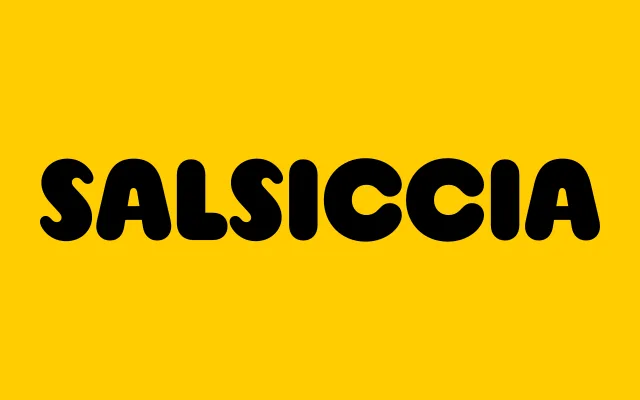
A single-weight rounded display face drawn from bold, chunky sign lettering of the 1970s, pairing classical proportions with inflated, jovial strokes.
About
Salsiccia takes its formal cues from hand-painted and printed signage of the 1970s, where thick, rounded letterforms were favoured for their legibility and warmth at large sizes. The design balances classical text proportions against an exuberantly heavy stroke weight, giving it a cheerful, approachable character suited to food, retail and entertainment contexts. Broad Latin Plus language support extends its reach across more than 200 languages.
Classification
A single-weight rounded display typeface with bold, chunky letterforms drawn from 1970s sign lettering. The heavy, inflated strokes and circular terminals place it firmly in the display category with a rounded sub-style.