 MegaMegaTypeType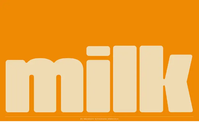
A bold retro display typeface with thick, rounded letterforms and large counters that echo mid-century American sign painting.
About
BN Sammy channels the visual language of 1950s and 60s commercial signage, built from heavy, rounded strokes and generously open counters. The tightly packed spacing between characters reinforces the dense, eye-catching quality typical of that era's lettering. It carries a friendly, energetic character suited to brand marks, packaging and display headlines.
Classification
Bold, playful retro display typeface with thick rounded letters, large counters and tightly packed characters. Evokes mid-century American signage from the 1950s-60s.
Languages
Latin
Tags
retroboldroundeddisplayplayful50s