 MegaMegaTypeType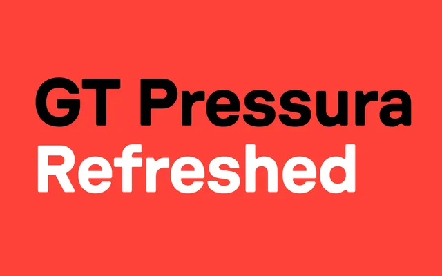
A grotesque sans drawn from metal type printing history and the stamped lettering found on shipping containers, using ink spread under pressure as a deliberate stylistic device.
About
Designed by Dominik Huber and Marc Kappeler of Moiré, GT Pressura takes the optical effects of ink pressing into paper and transfers them into a coherent sans-serif system. The family runs across 36 styles in three subfamilies: Standard, Mono and Extended, each available in six weights from Light to Black with matching italics. Script extensions cover Latin, Cyrillic, Greek and Vietnamese, and OpenType features include tabular figures, an alternate single-storey 'a' and case-sensitive forms.
Classification
GT Pressura draws from metal type printing and industrial stamped lettering, giving it a grotesque character defined by ink-spread aesthetics rather than conventional optical refinement.