 MegaMegaTypeType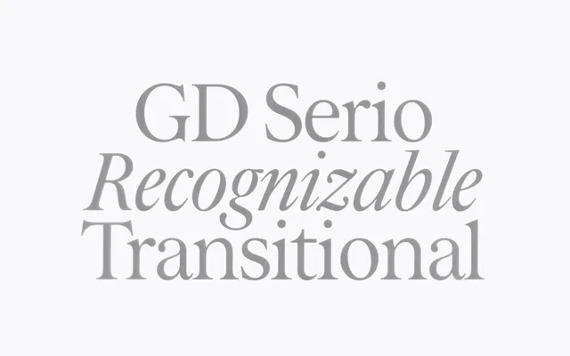
A 2025 transitional serif in two optical sizes, drawing on Caslon and Baskerville with an open double-storey 'g', small capitals and a full suite of figure styles.
About
Designed by Christoffer Granström, Marcus Gärde and Anders Wikström, GD Serio is built around 18th-century transitional models, with delicate details suited to sustained reading. Two optical cuts – Display and Text – allow the typeface to adapt from headline settings down to small body copy. OpenType features include old-style and tabular figures, proportional numbers, small capitals and standard and discretionary ligatures, with Latin script coverage across 200 or more languages.
Classification
Draws directly from 18th-century transitional models – Caslon and Baskerville – with the moderate stroke contrast, bracketed serifs and refined detail characteristic of that period. The open double-storey 'g' and delicate features confirm its transitional lineage.