 MegaMegaTypeType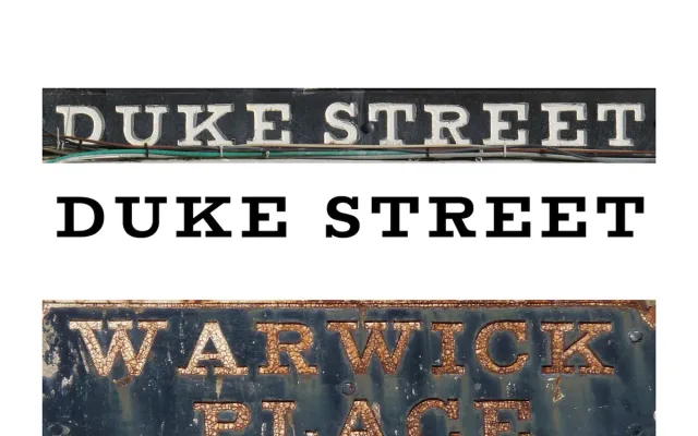
A slab serif drawn from the Regency-era metal street signs of Cheltenham, expanded into five weights across standard and condensed widths with a purpose-built lowercase.
About
Nick Cooke derived Pittville from the distinctive cast-metal street signs of Cheltenham, a spa town whose Georgian and Regency architecture lent its signage a particular character. The original signs used capitals only; Cooke designed a complementary lowercase and condensed width to extend the family's utility. All styles include small caps, multiple figure options and a stylistic alternate set featuring curved terminals, with a two-axis variable font available when licensing the full family.
Classification
A slab serif with origins in Regency-era metal street signage, featuring seriffed capitals with sturdy, bracketed slabs. The addition of a drawn lowercase and condensed width expands the original sign-lettering concept into a full text and display family.