 MegaMegaTypeType
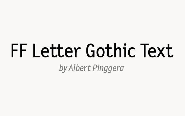
Albert Pinggera's proportional take on the classic Letter Gothic typewriter face, drawn for FontFont in the late 1990s.
About
Letter Gothic began life as a fixed-width IBM typewriter face; FF Letter Gothic Text keeps its plain, even strokes and drops the monospacing so it can set proper paragraphs. The result feels technical and a little bookish without the gaps that come with typewriter spacing. Three weights with italics, full figure sets and alternates make it a good fit for documentation, packaging copy and identities that want a quiet machine-made tone.
Classification
Proportionally spaced reworking of Letter Gothic, the monospaced typewriter face Roger Roberson drew for IBM in the 1950s. Albert Pinggera drew it between 1996 and 1998 as part of the FF Letter Gothic family, alongside FF Letter Gothic Mono and FF Letter Gothic Slang. Keeps the typewriter's open, even-stroked shapes while fixing the spacing for running text.