 MegaMegaTypeType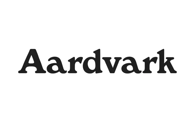
A 1905 British serif of genuinely eccentric character, blending Art Nouveau organicism with Bookman-era conventions to produce a family whose widths and weights feel more like distant cousins than a unified spectrum.
About
Designed by Eleisha Pechey and first released through Stephenson Blake's foundry, Windsor draws on the sinewy line work of Art Nouveau and the low-contrast conventions of Old Style serifs from the same era. Its most telling details — the forward-pitching lowercase 'a', ski-slope shoulders on the 'n' and 'm', egg-shaped bowls and a raised middle arm on the 'E' — appear across all weights, even as the heavier cuts soften into something closer to Cooper Black. Its longevity owes much to those idiosyncrasies, which have made it a persistent choice for nostalgic and illustrative work.
Classification
A low-contrast serif with pronounced Art Nouveau influence, featuring organic bowls, diagonal stress, angular serifs and idiosyncratic letterforms blending Bookman-era conventions with expressive fin-de-siècle stylisation.