 MegaMegaTypeType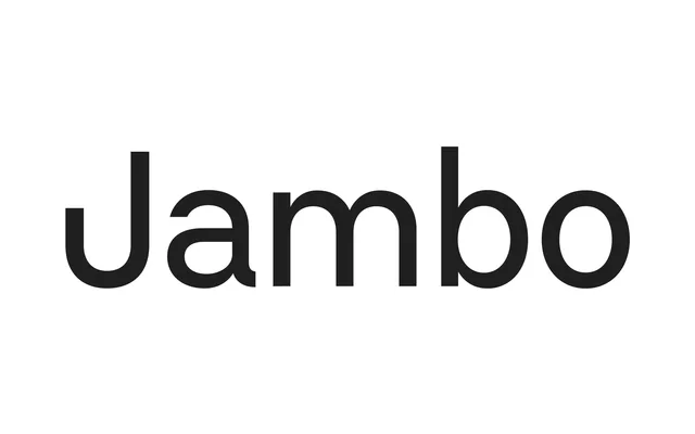
Berton Hasebe's 2016 geometric sans, distributed by Commercial Type, takes a 1932 Enschedé grotesque as its springboard and pushes narrow letterforms like 'r', 't' and 'j' into unusually wide proportions that give any setting an irregular visual rhythm.
About
Styrene comes in two widths: Styrene A pursues strict geometric forms, while Styrene B is narrower and better suited to running text. The family's defining tension sits between its clean, near-mono-line construction and a handful of genuinely eccentric glyphs – the pill-shaped numerals, the tucked capital 'J', the raised midline shared with engravers' gothics – that prevent it from ever settling into neutrality. Stylistic alternates, including a double-storey 'a' and a spurred 'u', allow designers to dial the grotesque character up or down depending on context.
Classification
A geometric sans with strong mechanical rules, rooted in a 1932 Enschedé specimen, combining round geometric forms with unusual wide proportions on narrow letterforms. Stylistic alternates allow the family to shift between geometric and grotesque registers.