 MegaMegaTypeType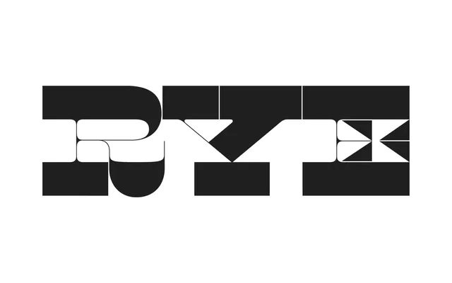
Kris Sowersby's 2014 reverse-stress display typeface adapts Debow's 19th-century Italian wood type into an extreme, hairline-and-slab construction of uncommon elegance.
About
Drawing from Caslon's Italian tradition and specifically from Debow's 20 & 8 Line Italian as documented in Rob Roy Kelly's American Wood Type, Maelstrom pushes the reverse-stress concept to its limits by reducing the middle strokes to pure hairlines while enlarging the triangular serif flags. The result is a typeface that functions as much as geometry and graphic presence as it does as lettering, operating best at monumental scale where its sandwich-like structure of massive slabs and serpentine connectors can be fully appreciated. Distributed by Klim Type Foundry, it has found particular use in music packaging, architectural posters and editorial design where typographic structure doubles as visual architecture.
Classification
Maelstrom is a reverse-stress display typeface, placing maximum weight on horizontal strokes while reducing vertical strokes to hairlines — an inversion of conventional serif stress rooted in 19th-century 'Italian' wood type tradition. Its extreme thick-to-thin contrast and all-caps construction place it firmly in the display category.