 MegaMegaTypeType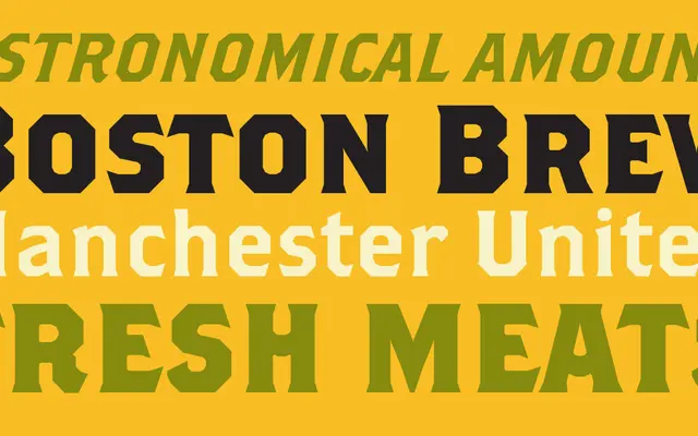
John Downer's 1999 display family for Emigre draws on American wood type and sports lettering traditions, offering three weights plus a decorative word logos font.
About
Brothers has a muscular, condensed character rooted in the American vernacular of athletic and circus typography. The family spans Regular, Bold and Super Slant cuts, with a companion Word Logos font providing pre-built logotype elements. Its broad stroke contrast and slab-inflected forms give it a commanding presence at display sizes.
Classification
A muscular, condensed display face with heavy slab-like bracketed serifs and pronounced weight, placing it firmly in the display category with slab serif characteristics. Its bold, athletic letterforms draw on American wood type and sports lettering traditions.