 MegaMegaTypeType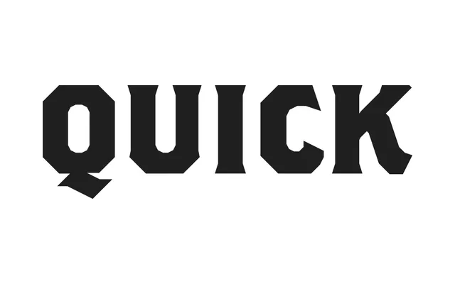
A display typeface by John Downer, distributed by Emigre, drawn from 1920s Cole Brothers circus lithographic lettering and refined into three weights with extensive alternates and Word Logo compositions.
About
Rooted in a Cole Brothers circus letterhead from the 1920s, Brothers translates hand-lettered lithographic forms into a coherent type family, preserving the chamfered outer edges, rounded counters, flared horizontal terminals and subdued Latin serifs of the source material. Three weights are available: Regular, Bold and SuperSlant, an extreme oblique of the regular; each weight includes an alternate set. A separate Word Logos weight provides signpainter-inspired phrase compositions alongside borders and manicules, extending the family's usefulness well beyond a standard type release.
Classification
Brothers is a display typeface characterised by chamfered edges, pointed Latin serifs and flared angled terminals, rooted in 1920s circus lithographic lettering. Its angular, high-personality construction places it firmly in the display category, with Latin serif detailing distinguishing it from conventional serif or slab classifications.