 MegaMegaTypeType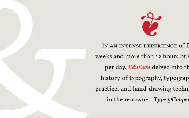
A humanist serif begun at the Type@Cooper programme in 2015 and refined over six years before its 2022 release, designed by Eduilson Coan with a calm, horizontal rhythm suited to sustained reading.
About
Conceived during an intensive five-week study at Type@Cooper in New York, Pausa matured across six years of revision, with its italics and lowercase details substantially reworked before publication. The design prioritises breath and space, reflecting its origins in hand-drawing and the slow accumulation of typographic knowledge. Three weights with matching italics are accompanied by thorough OpenType features including small caps, multiple figure styles and contextual swashes, with coverage of 209 Latin-script languages.
Classification
Pausa is a humanist serif with calligraphic origins, featuring moderate stroke contrast and refined serifs that evolved from hand-drawn letterforms. Its horizontal emphasis and considered spacing reflect a text-oriented disposition with classical proportions.