 MegaMegaTypeType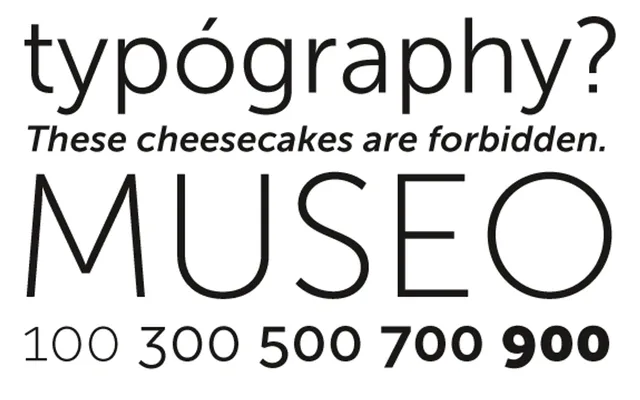
A sturdy, low-contrast geometric sans derived from Museo, offered in five weights with italics and two free cuts.
About
Museo Sans shares the familiar construction of its serif sibling Museo, translating its proportions into a clean, low-contrast geometric sans suited to both display and body text. The family spans five weights from 100 to 900, each with a matching italic, totalling ten fonts. OpenType features include ligatures, fractions, proportional and tabular figures in both lining and oldstyle variants, and case-sensitive forms; Central European languages and Esperanto are supported.
Classification
Low contrast, geometric sans-serif derived from Museo, sharing its sturdy construction and familiar proportions. Designed for versatility across both display and text settings.