 MegaMegaTypeType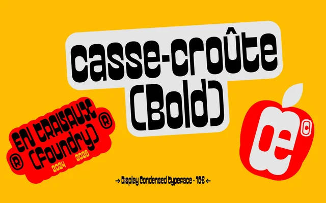
A squashed, reverse-contrast display face drawn from brush lettering and shaped like the filling of a sandwich.
About
Casse-croûte puts its weight on the horizontals, so the letters look pressed flat between two slices of bread. It began as brush work four years before release, and the short gap between capitals and lowercase gives it an even, modern rhythm. One Bold style, condensed enough for long words in tight spaces, plus a handful of pictograms.
Classification
Condensed reverse-contrast display face in one Bold style, with a small set of pictograms. Started as brush lettering in 2024 and sold from the foundry's Gumroad.
Weights
Bold
Optical sizes and widths
Condensed
Languages
Latin
Tags
displaycondensedreverse contrastcalligraphicexpressiveplayfulheadlineposterbranding