 MegaMegaTypeType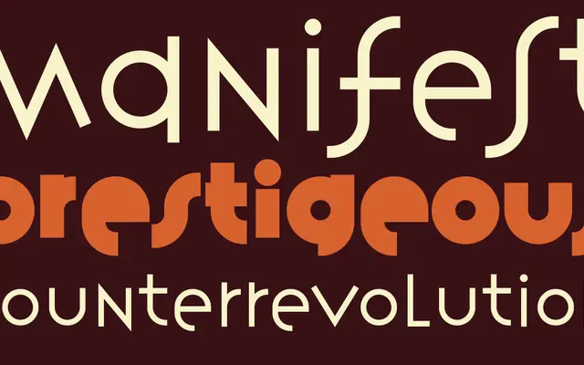
A three-weight sans-serif from 1988 by Rudy VanderLans and Zuzana Licko, reflecting the raw aesthetic of early digital type design on the Macintosh.
About
Designed during the formative years of desktop publishing, Variex carries the visual DNA of low-resolution screen fonts translated into printable outlines. Its letterforms have a deliberate, constructed quality that sets it apart from conventional grotesque conventions. The family spans three weights – Light, Regular and Bold – and remains a document of Emigre's early experimental output.
Classification
A digital-native sans-serif from the early desktop publishing era, designed with Licko's characteristic low-resolution bitmap aesthetic adapted into outline form. Its geometric yet irregular stroke construction resists easy classification within traditional grotesque or humanist camps.