 MegaMegaTypeType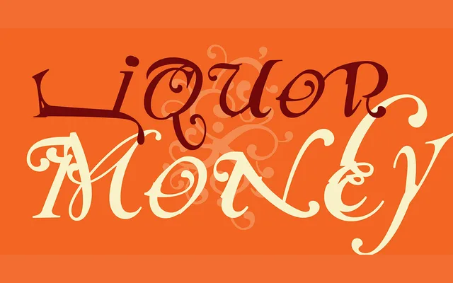
Mark Andresen's 1991 display face takes Caslon as a loose starting point and pushes it into deliberately rough, irregular territory across two variants.
About
Released by Emigre in 1991, NotCaslon plays on the conventions of the historic Caslon roman while rejecting its refinement in favour of expressive distortion. The two variants offer different degrees of that departure, giving designers a tool suited to confrontational or countercultural editorial work. It belongs firmly to the vernacular experimentation that defined Emigre's output in the early 1990s.
Classification
Loosely referencing Caslon's roman letterforms while deliberately subverting them through exaggerated irregularity and roughness, NotCaslon sits squarely in the display category as a deconstructed or vernacular serif rather than a functional text face.