 MegaMegaTypeType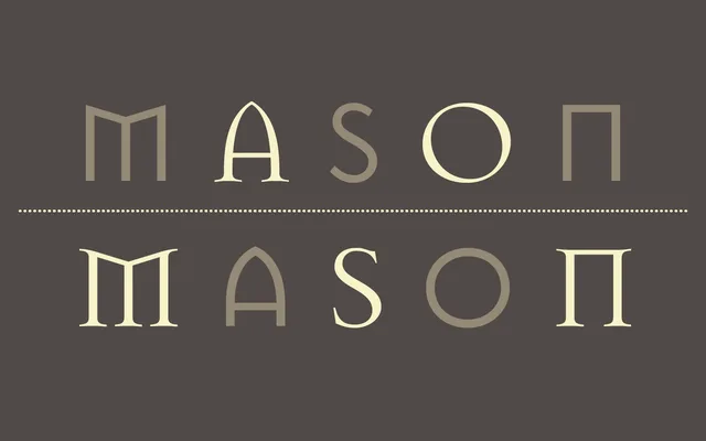
Jonathan Barnbrook's 1992 typeface for Emigre, combining serif and sans-serif cuts with irregular, historically inflected letterforms drawn from runic and stone-carving traditions.
About
Mason's two families — Serif and Sans — share a rough, hand-made quality that set it apart from the digital rationalism of its era. The letterforms draw on pre-Renaissance inscriptional sources, giving the face a ceremonial weight unusual for a 1990s release. Each family comes in Regular and Bold, sold individually or as a package.
Classification
Mason combines serif and sans-serif cuts with an irregular, hand-crafted quality and eccentric letterforms drawn from historical and runic sources, making it a display typeface with strong expressive character rather than a conventional text serif.