 MegaMegaTypeType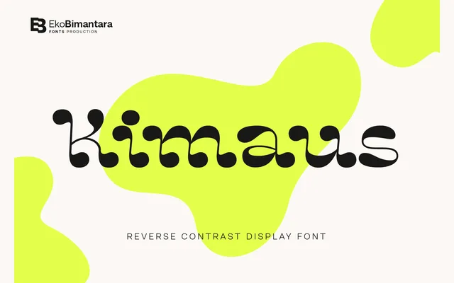
A single-weight reverse contrast display face drawing on classic cartoon lettering, aimed at titling, logos and retro-flavoured branding work.
About
Kimaus inverts conventional stroke weight by making horizontals heavier than verticals, a technique associated with nineteenth-century wood type and later cartoon lettering. The single Regular weight is intended for headline and logo use rather than text. Its retro warmth makes it a reasonable choice for playful branding projects, though the family's limited range reduces its versatility.
Classification
A reverse contrast display typeface with letterforms drawn from classic cartoon styling, where horizontal strokes are heavier than verticals, inverting conventional stroke weight distribution.
Weights
Regular
Languages
Latin
Tags
displayreverse-contrastretrocartoontitlingbrandinglogodecorative