 MegaMegaTypeType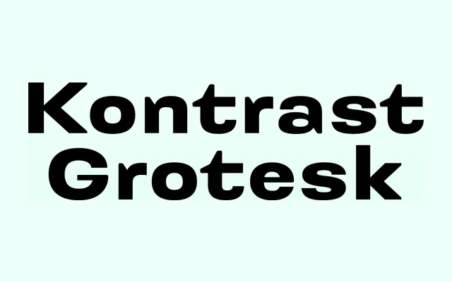
A Slovak grotesque from 2015 that applies stroke contrast along structural axes rather than calligraphic ones, inspired by W. A. Dwiggins's experiments with stroke variation.
About
Where most grotesques suppress contrast entirely, this family introduces it through the relationship between primary and secondary construction strokes – visible clearly in characters like 'E' – rather than through pen-angle logic alone. The result is a slightly wider, screen-optimised text face across five weights with italics and small caps. OpenType features include oldstyle figures, tabular variants, fractions and stylistic alternates.
Classification
A grotesque sans-serif distinguished by an unconventional approach to stroke contrast, where contrast is derived from the relationship between primary and secondary construction strokes rather than solely from the writing tool angle, inspired by W. A. Dwiggins's stroke experiments.