 MegaMegaTypeType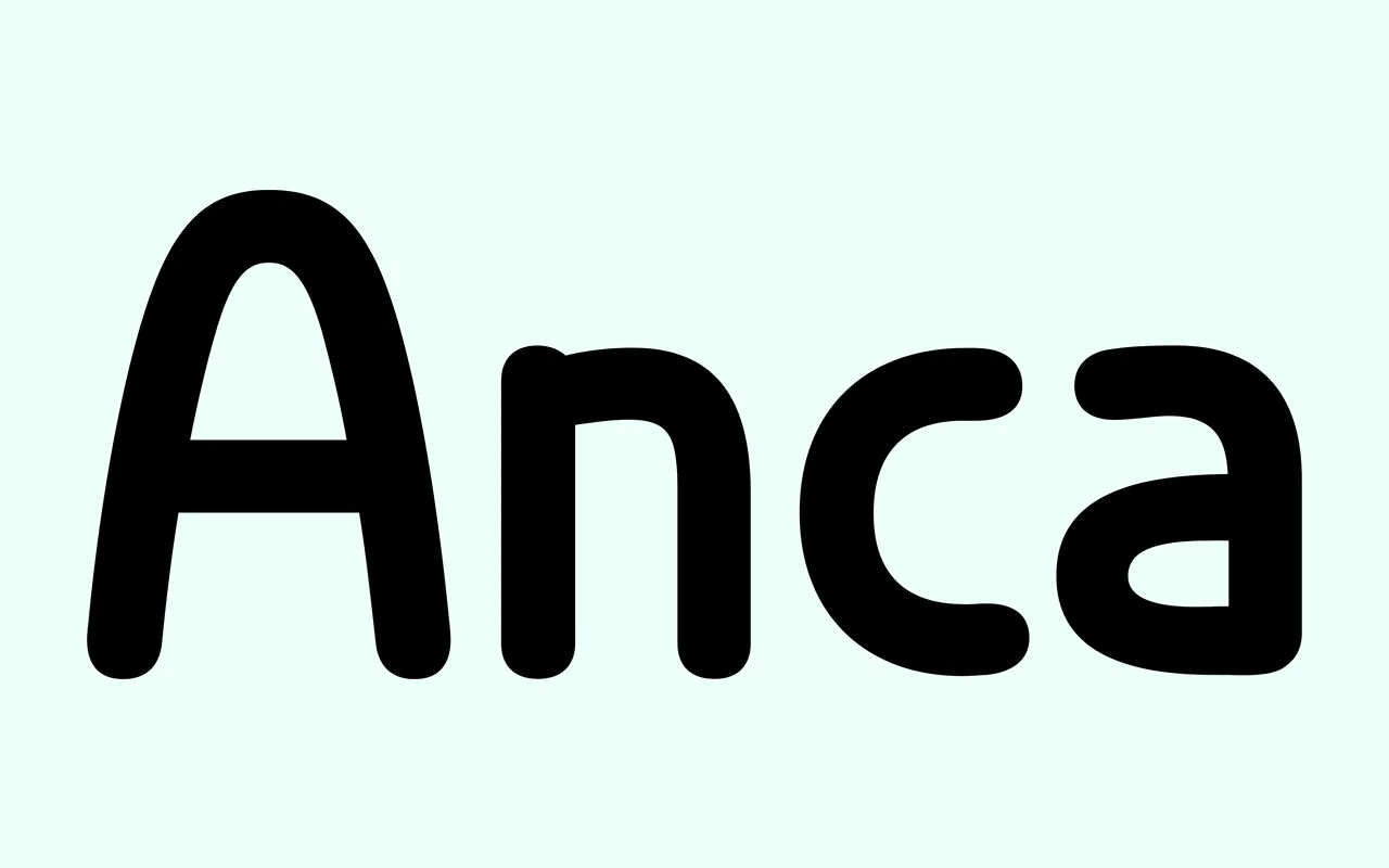
A playful 2011 sans-serif with rounded stroke ends and long ascenders, first drawn for the Fest Anca international animation festival.
About
Anca is built from as few strokes as possible, which gives unusual shapes to Q, w, j, A, & and §. Most letters are geometric, but a few strokes are left deliberately uneven so the texture feels natural. Three Marker fonts are designed to be layered over one another, and the family suits headings, short paragraphs and large lettering.
Classification
A geometric sans-serif on a minimal stroke skeleton, with rounded terminals, long ascenders and some deliberately uneven strokes. Display leaning, though it handles short text.
Weights
Regular
Family
Anca Marker 01Anca Marker 02Anca Marker 03
Languages
EstonianEnglishSwedishItalianSpanishCatalanPolishFinnishFrenchSlovakGermanCzechDutchAfrikaansAlbanianBasqueBretonNorwegian (Bokmål)IndonesianLatvianLithuanianSloveneNorwegian (Nynorsk)PortugueseHungarianSorbianKurdish (Latin)HawaiianEsperantoWelshFaroeseIcelandicRomanianLuxemburgishRomaniTurkishSámi (Inari)Sámi (Lule)Sámi (Southern)FriulianGalicianKashubianFijianIdoSardinianScottish Gaelic
Tags
geometricroundedplayfuldisplayfriendlylayeredfestival