 MegaMegaTypeType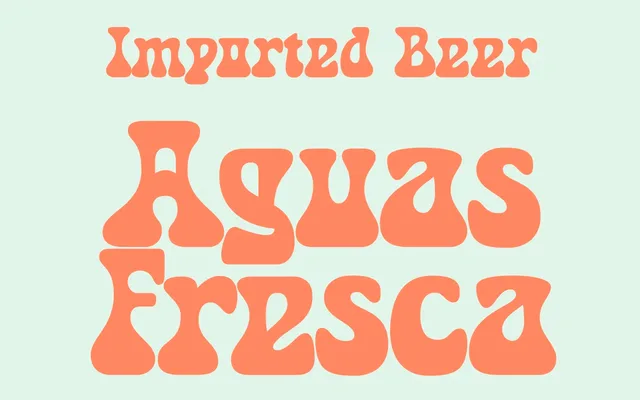
A three-weight rounded display face with thick strokes, slightly condensed proportions and a retro personality, including a novelty 'Groovy' weight for expressive use.
About
Opal Cave leans into bold, well-defined strokes and curvy letterforms that carry a distinctly retro sensibility. Three weights cover restrained to expressive: Light and Regular for versatility, Groovy for more spirited applications. The slightly condensed construction keeps letterforms compact while retaining the eye-catching quality the name implies.
Classification
A bold, rounded display typeface with a retro aesthetic, slightly condensed proportions and thick strokes. Its decorative 'Groovy' weight confirms its classification as a display face rather than a functional text family.
Weights
LightRegularGroovy
Languages
Latin
Tags
displayretroroundedboldgroovycondenseddecorativefun