 MegaMegaTypeType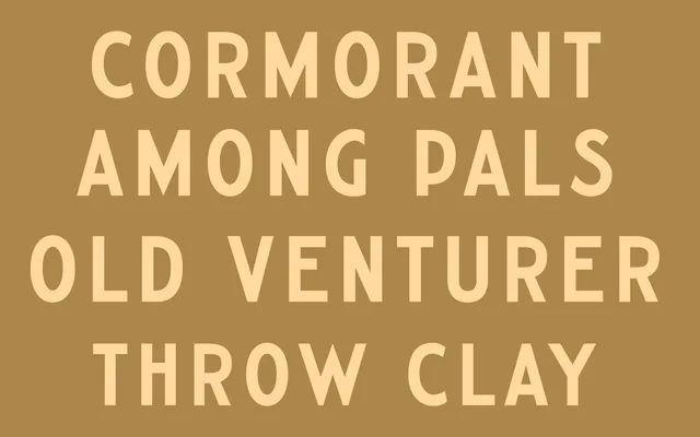
A six-weight gothic sans-serif drawing on Samuel Welo's 1927 lettering manuals and Ted Forbes's Highway Gothic, with deliberate stroke imperfections that give it a hand-rendered quality.
About
The design bridges mid-century American signage lettering and contemporary digital type, referencing both Welo's studio lettering guides and the utilitarian highway font tradition. Slight irregularities in the strokes are intentional, lending each weight a handcrafted warmth rather than the cold consistency of fully mechanised sans-serifs. Begun in 2020 and completed across multiple iterations, it is available under a single-user desktop licence for personal and commercial use.
Classification
A gothic-style sans-serif drawing from American sign-painting and highway lettering traditions, with deliberate hand-crafted irregularities in stroke weight that distinguish it from fully geometric or neutral grotesques.