 MegaMegaTypeType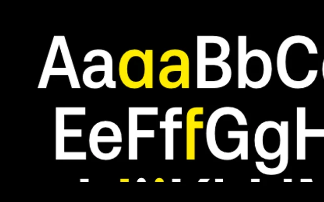
Aeonik Condensed applies the geometric precision and perpendicular terminals of the Aeonik family to a narrow-width form, built for headlines, posters and branding where horizontal space is at a premium.
About
A condensed companion to CoType's flagship grotesque, Aeonik Condensed keeps the closed apertures, rigid perpendicular stroke endings and geometric roundness that define the family, simply compressed into a narrower body. Eight weights from Air to Black, each with a matching italic, cover the full editorial and branding range. Variable font support allows fine-grained weight control across the entire axis, and the Latin, Cyrillic, Greek and Vietnamese coverage carries it across most international projects.
Classification
Condensed width variant of the Aeonik family. Swiss grotesque with a geometric skeleton; perpendicular stroke terminals on 'a', 't', 'f' and 'j'; geometric roundness on 'c', 'e' and 'o'; closed apertures throughout. Available as a variable font. Developed by Mark Bloom and Diana Ovezea as a sibling to Aeonik, Aeonik Extended, Aeonik Soft, Aeonik Fono and Aeonik Mono.